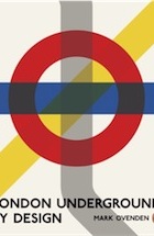
Mark Ovenden offers a fascinating look at the evolution of the London underground's visual identity
The underground’s tiled stations –
‘probably inspired by the decor of public lavatories’ – were soon copied on the
Paris Métro.
This year marks the 150th
anniversary of the first London underground
line, the Metropolitan. The Met is being celebrated mainly for its engineering,
and it is commonly thought that, having heroically dug their giant trench from
Paddington to Farringdon, the pioneers weren't too bothered about
conceptualising the look of the thing. Illustrations do suggest that the early
surface buildings were perfunctory and disparate. But in this authoritative
chronicle of underground design, Mark Ovenden detects "early examples of
corporate branding": for example in the consistent use of large gas globes to
contain gas lights.
Some of the first pictures
in this book – which bristles with photographs I've never seen before – show how
London's commercial free-for-all
obstructed the early fumbling after coherence and clarity. A shot from the 1870s
of the facade of Victoria underground station shows what Ovenden calls a
"shouty" hoarding for "TP Beattie, Specialist in Plumbing and Sanitary
Engineering" as almost upstaging the station name.
 Real aesthetic progress began with the advent of the deep-level lines, the
tubes properly so-called, in the 1890s. To counteract claustrophobia, both the
City & South London (which would later become the Bank branch of the
Northern line) and the Central had bright, white-tiled stations. The idea –
probably inspired by the decor of public lavatories – was copied on the Paris
Métro. Other tubes were built during the Edwardian period by Charles Tyson
Yerkes. He was an American fraudster and philanderer, but also a great
benefactor to London, not least through his employment of architect Leslie
Green, most of whose stations survive in central London. The exteriors are
covered in tiles usually denoted as "oxblood" (purple-red); the ticket halls are
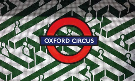
predominantly a deep, relaxing green, with art nouveau swirls. Below ground,
each station had – and has – its own colour scheme, for the benefit of
illiterate passengers.
Real aesthetic progress began with the advent of the deep-level lines, the
tubes properly so-called, in the 1890s. To counteract claustrophobia, both the
City & South London (which would later become the Bank branch of the
Northern line) and the Central had bright, white-tiled stations. The idea –
probably inspired by the decor of public lavatories – was copied on the Paris
Métro. Other tubes were built during the Edwardian period by Charles Tyson
Yerkes. He was an American fraudster and philanderer, but also a great
benefactor to London, not least through his employment of architect Leslie
Green, most of whose stations survive in central London. The exteriors are
covered in tiles usually denoted as "oxblood" (purple-red); the ticket halls are
predominantly a deep, relaxing green, with art nouveau swirls. Below ground,
each station had – and has – its own colour scheme, for the benefit of
illiterate passengers.Full article


No comments:
Post a Comment