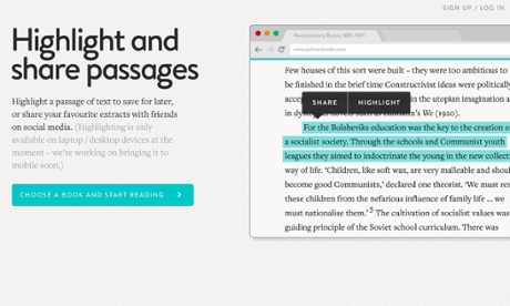
With subtle interactive features and simple, bold design, Penguin’s resurrected non-fiction imprint places the focus on the reading experience

After reading Economics: The User’s Guide by Ha-Joon Chang, published by Pelican Books, I feel confident enough to explain the word “disintermediation”. This catchy term means cutting out the middlemen from a supply chain, and it’s crucial to an understanding of modern publishing. Amazon has been trying to cut out publishers for two decades, in the hope of achieving a more efficient ecosystem. Publishers, once they got wind of this, started thinking of clever ways they could turn the tables: that is, cutting out Amazon and going direct to consumers.
A new front in this literary conflict has opened at pelicanbooks.com, although it looks less like a battlefield than a boutique in an online Marylebone High Street. Penguin’s original non-fiction imprint relaunched earlier this year, its predictably covetable paperbacks glowing with turquoise nostalgia for the days when people bettered themselves rather than slumping in front of Gogglebox. Pelican’s digital incarnation is stunning, its flat design bold yet understated, with a studied simplicity reflected in the intuitive user experience.
More
No comments:
Post a Comment